

もう3年ほど活用させていただいている、わいひらさんが開発したWordpress用の純国産の無料テーマ、「Simplicty」。
私のようなWordpress初心者でもデフォルトのウィジェットを活用することで、サイトに必要な機能を簡単に実装できるところが最大の魅力のテーマです。
また国内では広く使われているテンプレートなので、簡単にカスタマイズできる術を公開している方も多く、ほとんどコピーペーストにてやりたいようにデザインできるのも良いところです。
今回、自分用の備忘録として現在カスタマイズしたポイントをリストとして列挙していきます。
※このページは随時カスタマイズするごとにアップデートしていく予定です。
<Simplicityカスタマイズリスト>
- 記事一覧サムネイル画像を大きく長方形にカスタマイズする
- カテゴリ別新着記事をヘッダー下に表示する
- スマホ表示にグローバルナビを設置するカスタマイズ
- モバイル表示時に横スクロールできるグローバルメニューを設置
- グローバルナビを常に上部にスクロール表示
- 本文記事の複数のh2見出し前にAdsenseを表示
- 記事を読む時間表示プラグイン修正(固定ページに表示しない)
- TOPページを2カラム化して見やすくする
- Simplicityのバイラルタイプのシェアボタンを均等に横一列にする方法
- Simplicityの固定TOPページを3カラム化
- Meta SliderのCSSカスタマイズ方法
- TOC+ 目次をおしゃれにデザインカスタマイズする
- サイドバーにプロフィールcssカスタマイズ
- Amazonjsカスタマイズ(テキスト追加)
- Amazonjsカスタマイズ(楽天リンクをつける)
- PHP7.0に変更、古いプラグインを停止・削除
- AmazonプラグインをCocoonのショートコードに一括変換
- ブログカテゴリーを整理
- ウィジェットをショートコードで利用
- カテゴリー一覧ページに情報付加
記事一覧サムネイル画像を大きく長方形にカスタマイズする
こちら参考にしたもん吉さんの記事です。

このカスタマイズをするためには、完全レスポンシブデザインにするを「OFF」に、 一覧(インデックス)ページの表示スタイル設定を「エントリーカード(デフォルト)」にしておく必要があります。
子テーマにあるfunctions.phpに以下コードを追加します。
add_image_size('thumb250',336,224,true);
デザインは子テーマにあるstyle.cssに追加します。
/* サムネイルサイズ指定 */
.entry-thumb img {
    width: 336px;
    height: 224px;
    margin-bottom: 40px;
}

/* 記事タイトルなどの位置 */
.entry-card-content {
    margin-left: 320px !important;
}

/* スマホの設定 */
@media screen and (max-width: 480px) {

/* サムネイル回り込み */
.entry-thumb {
  float: none !important;
  margin: 6px 4px 3px 0px !important;
}

/* サムネイルサイズ変更 */
.entry-thumb img{
    width: 336px !important;
    height: 224px !important;
}

/* 記事タイトルなどの位置 */
.entry-card-content {
    margin-left: 0px !important;
}

.entry-snippet {
  font-size: 100% !important;
}

.entry-read a {
  font-size: 100% !important;
}
}
最後にサムネイル画像を調整するために、 プラグイン「Regenerate Thumbnails」を実行して、終了!
カテゴリ別新着記事をヘッダー下に表示する
TOPページの記事リスト上段にカテゴリ毎の最新記事をタイル状に5つ並べる方法。
PC向けページ限定です。
モバイルは表示させていませんが、スライダーなどのプラグインを使って実装する方法もあると思います。
参考にしたのはこちらの記事です。
コーピーペーストで簡単実装できます。
コード中のスラッグ名、カテゴリ名は各自のサイトのものに置き換えます。

Simplicity 2.4の場合は、子テーマの中にある「before-main.php」に以下コードをコピペするだけです。
<?php if ( is_home() || is_front_page() ) : ?>
	<?php if (is_mobile()) :?>
	<?php else: ?>
		<?php if ($paged <= 1): ?>
			<!-- 新着カテゴリ1 -->
			<div class="cat_article1">

			<?php
			    $cat = '(スラッグ名1)';
			    $num = '1';
			    global $post;

			    $term_id = get_category_by_slug($cat)->term_id;
			    $myposts = get_posts('numberposts=' .$num. '&category_name=' .$cat);
				if ($myposts) {
					foreach($myposts as $post):
			        		setup_postdata($post);
			?>
						<a class="anchor" href="/category/(スラッグ名1)">カテゴリ1</a>
						<a class="thumbnail" href="<?php the_permalink() ?>">
						<div class="cat_article_thumb">
							<?php if(has_post_thumbnail()){ ?>
								<?php $title= get_the_title(); the_post_thumbnail(array(720, 480), array( 'alt' =>$title, 'title' => $title)); ?>
							<?php }else{ ?>
						               <i class="ico-camera-alt"></i>
							<?php } ?>
								<p class="postcat1">カテゴリ新着記事</p>
								<span class="cat_text_area"><?php the_title(); ?></span>
								<span class="cat-update"><span class="lsf">time </span><?php the_time('Y/m/d') ?></span>
						</div>
						</a>
			<?php
					endforeach;
			?>
				<?php }else{ ?>
				    <p>記事がありません</p>
				<?php } ?>
			</div>

			<!-- 新着カテゴリ2 -->
			<div class="cat_article2">

			<?php
			    $cat = '(スラッグ名2)';
			    $num = '1';
			    global $post;

			    $term_id = get_category_by_slug($cat)->term_id;
			    $myposts = get_posts('numberposts=' .$num. '&category_name=' .$cat);
				if ($myposts) {
					foreach($myposts as $post):
			        		setup_postdata($post);
			?>
						<a class="anchor" href="/category/(スラッグ名2)">カテゴリ2</a>
						<a class="thumbnail" href="<?php the_permalink() ?>">
						<div class="cat_article_thumb">
							<?php if(has_post_thumbnail()){ ?>
								<?php $title= get_the_title(); the_post_thumbnail(array(720, 480), array( 'alt' =>$title, 'title' => $title)); ?>
							<?php }else{ ?>
						               <i class="ico-camera-alt"></i>
							<?php } ?>
								<p class="postcat1">カテゴリ新着記事</p>
								<span class="cat_text_area"><?php the_title(); ?></span>
								<span class="cat-update"><span class="lsf">time </span><?php the_time('Y/m/d') ?></span>
						</div>
						</a>
			<?php
					endforeach;
			?>
				<?php }else{ ?>
				    <p>記事がありません</p>
				<?php } ?>
			</div>

			<!-- 新着カテゴリ3 -->
			<div class="cat_article3">

			<?php
			    $cat = '(スラッグ名3)';
			    $num = '1';
			    global $post;

			    $term_id = get_category_by_slug($cat)->term_id;
			    $myposts = get_posts('numberposts=' .$num. '&category_name=' .$cat);
				if ($myposts) {
					foreach($myposts as $post):
			        		setup_postdata($post);
			?>
						<a class="anchor" href="/category/(スラッグ名3)">カテゴリ3</a>
						<a class="thumbnail" href="<?php the_permalink() ?>">
						<div class="cat_article_thumb">
							<?php if(has_post_thumbnail()){ ?>
								<?php $title= get_the_title(); the_post_thumbnail(array(720, 480), array( 'alt' =>$title, 'title' => $title)); ?>
							<?php }else{ ?>
						               <i class="ico-camera-alt"></i>
							<?php } ?>
								<p class="postcat1">カテゴリ新着記事</p>
								<span class="cat_text_area"><?php the_title(); ?></span>
								<span class="cat-update"><span class="lsf">time </span><?php the_time('Y/m/d') ?></span>
						</div>
						</a>
			<?php
					endforeach;
			?>
				<?php }else{ ?>
				    <p>記事がありません</p>
				<?php } ?>
			</div>

			<!-- 新着カテゴリ4 -->
			<div class="cat_article4">

			<?php
			    $cat = '(スラッグ名4)';
			    $num = '1';
			    global $post;

			    $term_id = get_category_by_slug($cat)->term_id;
			    $myposts = get_posts('numberposts=' .$num. '&category_name=' .$cat);
				if ($myposts) {
					foreach($myposts as $post):
			        		setup_postdata($post);
			?>
						<a class="anchor" href="/category/(スラッグ名4)">カテゴリ4</a>
						<a class="thumbnail" href="<?php the_permalink() ?>">
						<div class="cat_article_thumb">
							<?php if(has_post_thumbnail()){ ?>
								<?php $title= get_the_title(); the_post_thumbnail(array(720, 480), array( 'alt' =>$title, 'title' => $title)); ?>
							<?php }else{ ?>
						               <i class="ico-camera-alt"></i>
							<?php } ?>
								<p class="postcat1">カテゴリ新着記事</p>
								<span class="cat_text_area"><?php the_title(); ?></span>
								<span class="cat-update"><span class="lsf">time </span><?php the_time('Y/m/d') ?></span>
						</div>
						</a>
			<?php
					endforeach;
			?>
				<?php }else{ ?>
				    <p>記事がありません</p>
				<?php } ?>
			</div>

			<!-- 新着カテゴリ5 -->
			<div class="cat_article5">

			<?php
			    $cat = '(スラッグ名5)';
			    $num = '1';
			    global $post;

			    $term_id = get_category_by_slug($cat)->term_id;
			    $myposts = get_posts('numberposts=' .$num. '&category_name=' .$cat);
				if ($myposts) {
					foreach($myposts as $post):
			        		setup_postdata($post);
			?>
						<a class="anchor" href="/category/(スラッグ名5)">カテゴリ5</a>
						<a class="thumbnail" href="<?php the_permalink() ?>">
						<div class="cat_article_thumb">
							<?php if(has_post_thumbnail()){ ?>
								<?php $title= get_the_title(); the_post_thumbnail(array(720, 480), array( 'alt' =>$title, 'title' => $title)); ?>
							<?php }else{ ?>
						               <i class="ico-camera-alt"></i>
							<?php } ?>
								<p class="postcat1">カテゴリ新着記事</p>
								<span class="cat_text_area"><?php the_title(); ?></span>
								<span class="cat-update"><span class="lsf">time </span><?php the_time('Y/m/d') ?></span>
						</div>
						</a>
			<?php
					endforeach;
			?>
				<?php }else{ ?>
				    <p>記事がありません</p>
				<?php } ?>
			</div>
		<?php endif; ?>
	<?php endif; ?>
<?php endif; ?>
あとはレイアウトをstyle.cssで調整します。
もちろん、こちらも子テーマ側のstyle.cssに追加します。
/* 最新のカテゴリ記事
--------------------------------------------------------- */
.cat_article1 {
	margin:0 0px 15px 0px;
	float: left;
	width: 19.6%;
}
.cat_article2 {
	margin:0 0px 15px 5px;
	float: left;
	width: 19.6%;
}
.cat_article3 {
	margin:0 0px 15px 5px;
	float: left;
	width: 19.6%;
}
.cat_article4 {
	margin:0 0px 15px 5px;
	float: left;
	width: 19.6%;
}
.cat_article5 {
	margin:0 0px 15px 5px;
	float: left;
	width: 19.6%;
}
.cat_article_thumb {
	width: 100%;
	overflow: hidden;
	position: relative;
}
.cat_article1 .anchor {
	padding: 3px 5px;
	display: block;
	color: #fff;
	background: #333;
	font-size: 16px;
	text-decoration: none;
	overflow: hidden;
	*zoom: 1;
	text-align: center;
}
.cat_article1 .anchor:hover, .cat_article1 .anchor:active {
	text-decoration: underline;
}
.cat_article1 .anchor span {
	float: right;
	font-size: 9px;
	background: #fff;
	color: #333;
	padding: 5px 3px;
}
.cat_article1 .thumbnail {
	display: block;
	color: #333;
	background: #fff;
	text-decoration: none;
	line-height: 1.5;
	font-size: 16px;
	position: relative;
	overflow: hidden;
	*zoom: 1;
}
.cat_article1 .thumbnail img {
	width: 100%;
	height: 180px;
	display: block;
}
.cat_article1 .thumbnail:hover {
	color: #e22f26;
	background: #ffffea;
}
.cat_article1 .thumbnail .title {
	padding: 3px;
	height: 70px;
}
.cat_article2 .anchor {
	padding: 3px 5px;
	display: block;
	color: #fff;
	background: #333;
	font-size: 16px;
	text-decoration: none;
	overflow: hidden;
	*zoom: 1;
	text-align: center;
}
.cat_article2 .anchor:hover, .cat_article2 .anchor:active {
	text-decoration: underline;
}
.cat_article2 .anchor span {
	float: right;
	font-size: 9px;
	background: #fff;
	color: #333;
	padding: 5px 3px;
}
.cat_article2 .thumbnail {
	display: block;
	color: #333;
	background: #fff;
	text-decoration: none;
	line-height: 1.5;
	font-size: 16px;
	position: relative;
	overflow: hidden;
	*zoom: 1;
}
.cat_article2 .thumbnail img {
	width: 100%;
	height: 180px;
	display: block;
}
.cat_article2 .thumbnail:hover {
	color: #e22f26;
	background: #ffffea;
}
.cat_article2 .thumbnail .title {
	padding: 3px;
	height: 70px;
}
.cat_article3 .anchor {
	padding: 3px 5px;
	display: block;
	color: #fff;
	background: #333;
	font-size: 16px;
	text-decoration: none;
	overflow: hidden;
	*zoom: 1;
	text-align: center;
}
.cat_article3 .anchor:hover, .cat_article3 .anchor:active {
	text-decoration: underline;
}
.cat_article3 .anchor span {
	float: right;
	font-size: 9px;
	background: #fff;
	color: #333;
	padding: 5px 3px;
}
.cat_article3 .thumbnail {
	display: block;
	color: #333;
	background: #fff;
	text-decoration: none;
	line-height: 1.5;
	font-size: 16px;
	position: relative;
	overflow: hidden;
	*zoom: 1;
}
.cat_article3 .thumbnail img {
	width: 100%;
	height: 180px;
	display: block;
}
.cat_article3 .thumbnail:hover {
	color: #e22f26;
	background: #ffffea;
}
.cat_article3 .thumbnail .title {
	padding: 3px;
	height: 70px;
}
.cat_article4 .anchor {
	padding: 3px 5px;
	display: block;
	color: #fff;
	background: #333;
	font-size: 16px;
	text-decoration: none;
	overflow: hidden;
	*zoom: 1;
	text-align: center;
}
.cat_article4 .anchor:hover, .cat_article4 .anchor:active {
	text-decoration: underline;
}
.cat_article4 .anchor span {
	float: right;
	font-size: 9px;
	background: #fff;
	color: #333;
	padding: 5px 3px;
}
.cat_article4 .thumbnail {
	display: block;
	color: #333;
	background: #fff;
	text-decoration: none;
	line-height: 1.5;
	font-size: 16px;
	position: relative;
	overflow: hidden;
	*zoom: 1;
}
.cat_article4 .thumbnail img {
	width: 100%;
	height: 180px;
	display: block;
}
.cat_article4 .thumbnail:hover {
	color: #e22f26;
	background: #ffffea;
}
.cat_article4 .thumbnail .title {
	padding: 3px;
	height: 70px;
}
.cat_article5 .anchor {
	padding: 3px 5px;
	display: block;
	color: #fff;
	background: #333;
	font-size: 16px;
	text-decoration: none;
	overflow: hidden;
	*zoom: 1;
	text-align: center;
}
.cat_article5 .anchor:hover, .cat_article5 .anchor:active {
	text-decoration: underline;
}
.cat_article5 .anchor span {
	float: right;
	font-size: 9px;
	background: #fff;
	color: #333;
	padding: 5px 3px;
}
.cat_article5 .thumbnail {
	display: block;
	color: #333;
	background: #fff;
	text-decoration: none;
	line-height: 1.5;
	font-size: 16px;
	position: relative;
	overflow: hidden;
	*zoom: 1;
}
.cat_article5 .thumbnail img {
	width: 100%;
	height: 180px;
	display: block;
}
.cat_article5 .thumbnail:hover {
	color: #e22f26;
	background: #ffffea;
}
.cat_article5 .thumbnail .title {
	padding: 3px;
	height: 70px;
}
.cat-update{
	font-size: 0.7em;
	position:absolute;
	top:0px;
	left:0px;
	color: #fff;
	background: none repeat scroll 0 0 rgba(0, 0, 0, 0.5);
}
.cat_text_area {
	padding: 0 4px 0;
	position: absolute;
	bottom: 0;
	right: 0;
	left: 0;
	color: #fff;
	font-weight: bold;
	overflow: hidden;
	height: 80px;
	line-height: 20px;
	font-size: 15px;
	text-decoration: none;
	background: rgba(3,3,3,0.6);
	background: -webkit-gradient(linear,left top,left bottom,from(rgba(0,0,0,0)),to(rgba(2,2,2,1.0)));
	background: -moz-linear-gradient(top, rgba(0,0,0,0), rgba(2,2,2,1.0));
	text-shadow: 0 0 5px rgba(0,0,0,1.0);
}
.postcat1 {
	position:absolute;
	top:0px;
	right:0px;
	background-color: #EA3382;
	color: #ffffff;
	display: inline-block;
	font-size: 12px;
	line-height: 1.5;
	margin: 0;
	padding: 0px 10px 0;
}
/* ここまで
このコードは本当に感謝してます。
スマホ表示にグローバルナビを設置するカスタマイズ
Simplicityにはスマホ用にデフォルトで3つのグローバルメニュー表示が用意されていますが、わざわざメニューをクリックする必要があるためPCと同じく見た目ですぐにわかるメニューをつけるカスタマイズです。
タイトル下に表示範囲内で自分の好みのカテゴリーなどをメニューとして表示します。
子テーマの「before-main.php」に以下コードを追加します。
<?php if ( wp_is_mobile() ) : ?>

<div id="sm_nav">
<span class="category"><a href='http://AAAAA/'>メニュー1</a></span>
<span class="category"><a href='http://BBBBB/'>メニュー2</a></span>
<span class="category"><a href='http://CCCCC/'>メニュー3</a></span>
<span class="category"><a href='http://DDDDD/'>メニュー4</a></span>
</div>

<?php else: ?>
<?php endif; ?>
次に子テーマのスタイルシート(css)に以下ソースをコピペで追記します。
#sm_nav{
 text-align: center;
}
#sm_nav .category{
 background-color: #35A6A0;
 padding:8px;
 line-height: 230%;
 font-size:90%;
border-radius: 4px;
}
#sm_nav a{
 color: #FFFFFF;
 text-decoration: none;
 word-wrap: break-word;
}
以下、色などの変更について。
・5行目のbackground-colorでメニュー部分の背景の色を変更。
・6行目のpaddingはメニューの背景の範囲(文字からどのくらいの距離まで背景をつけるか)とメニューとメニューの間隔を調整。
・7行目のline-heightは、2行以上になるときの行間。
・9行目のborder-radiusは、メニュー背景の角の丸みを調整。
・12行目のColorでメニューの文字色の変更。

まだ試行錯誤の最中ですので変更する可能性はあります。
上記方法だと表示領域が限られるのでPCと同じメニューが表示されるわけではありません。
今後はスライダー方式でメニューをPCと同じ項目数を表示させることを検討中です。
モバイル表示時に横スクロールできるグローバルメニューを設置
スマホで表示されるメニューをPC同様に表示し、横スライドで選択できるようにするカスタマイズです。
子テーマの「before-main.php」に以下をコピペで追記します。
<?php if ( wp_is_mobile() ) : ?>

<div id="mb-nume">
<span  class="cate"><a href='カテゴリー1のURL'>カテゴリー1</a></span>
<span  class="cate"><a href='カテゴリー2のURL'>カテゴリー2</a></span>
</div>

<?php else: ?>
<?php endif; ?>
次に子テーマのスタイルシート(css)に以下をコピペで追記します。
#mb-nume{
   display: flex;
   display: -moz-flex;
   display: -o-flex;
   display: -webkit-flex;
   display: -ms-flex;
   overflow-x: scroll;
   flex-direction: row;
   -moz-flex-direction: row;
   -o-flex-direction: row;
   -webkit-flex-direction: row;
   -ms-flex-direction: row;
   display: -webkit-flex;
   width: 100%;
     text-align: center;

}

#mb-nume a{
 color: #fff;
 text-decoration: none;
 word-wrap: break-word;
}

#mb-nume .cate{
    background-color: rgba(6, 6, 6, 0.9);
    padding:5px;
    border-radius: 10px;
    min-width: 150px;
    max-width: 150px;
}
・カテゴリー名が長くなって改行する場合は、width:の値を大きくすることで修正可能。
・文字の大きさはfont-size、背景色はbackground-colorで変更可能。
こちら参考になったひがしさん(@Plus_A_Blog)の記事です。

グローバルナビを常に上部にスクロール表示
グローバルメニューを常に上部に固定して表示させるカスタマイズです。
参考になったのはこちらのブログ記事です。

子テーマのスタイルシート(css)にコピペするだけで実装できます。
#navi{
  background:#ddd;
  border-top:none;
  border-bottom:1px solid #000;
  padding:0 0 0 0;
  position:fixed;
  top:0;
  z-index:9999;
  width:2000px;
}

#navi ul {
  background:#ddd;
}

#navi ul li a {
  font-size: 16px;
  font-weight:bold;
  color:#095;
  padding:3px 20px;
}

#navi ul li a:hover{
  color:#c03 !important;
}

最終的に試行錯誤の結果、こちらのカスタマイズの方がうまくいきました(2017/01/07) ⇒ さらに変更。
#navi{
  background:#555;
  border-top:none;
  border-bottom:1px solid #000;
  padding:0 0 0 0;
  position:fixed;
  top:0;
  z-index:9999;
  width:100%;
}

#navi ul {
  background:#555;
}

#navi ul li a {
    font-size: 14px;
   /* font-weight:bold; */
    color:#fff;
    padding:3px 12px;
}

#navi ul li a:hover{
  color:#333;
  background:#eee !important;
}

#navi-in{
  margin:0px auto;
  width:1200px;
}
/*
#navi ul > li{
  border-right:1px solid #fff;
  line-height:1.3;
}

#navi ul > li:last-child{
  border-right:none;
}
*/
※2017/1/7追記
結局Clingifyを使って実装しました。

本文記事の複数のh2見出し前にAdsenseを表示
Simplicityはよくできたテーマで広告ウィジェットを使えばh2前にAdsenseを表示できます。
しかしながら、1つしか表示できないため複数のh2の見出し前にAdsenseを表示するためにカスタマイズを行いました。子テーマのfunctions.phpに追記するだけです。
もちろんバックアップも忘れずに!
参考にしたのはこちらの記事とフォーラムの書き込みです。

こちらの基本コードに下のフォーラムのカスタマイズ部分を反映してみました。
基本コードはこちら。
function add_ad_before_h2_for_3times($the_content) {
//1つ目の広告タグを挿入
$ad1 = <<< EOF
//////////////////////////
//ここにアドセンスを挿入//
//////////////////////////
EOF;
//2つ目の広告タグを挿入
$ad2 = <<< EOF
//////////////////////////
//ここにアドセンスを挿入//
//////////////////////////
EOF;
//3つ目の広告タグを挿入
$ad3 = <<< EOF
//////////////////////////
//ここにアドセンスを挿入//
//////////////////////////
EOF;

  if ( is_single() ) {//投稿ページ
    $h2 = '/^<h2.*?>.+?<\/h2>$/im';//H2見出しのパターン
    if ( preg_match_all( $h2, $the_content, $h2s )) {//H2見出しが本文中にあるかどうか
      if ( $h2s[0] ) {//チェックは不要と思うけど一応
        if ( $h2s[0][0] ) {//1番目のH2見出し手前に広告を挿入
          $the_content  = str_replace($h2s[0][0], $ad1.$h2s[0][0], $the_content);
        }
        if ( $h2s[0][1] ) {//2番目のH2見出し手前に広告を挿入
          $the_content  = str_replace($h2s[0][1], $ad2.$h2s[0][1], $the_content);
        }
        if ( $h2s[0][2] ) {//3番目のH2見出し手前に広告を挿入
          $the_content  = str_replace($h2s[0][2], $ad3.$h2s[0][2], $the_content);
        }
      }
    }
  }
  return $the_content;
}
add_filter('the_content','add_ad_before_h2_for_3times');
こちらをベースに下記のようにカスタマイズしています。
1つ目のh2見出し前の広告は、Simplicity標準の広告ウィジェット(h2見出し前用)を使っているので、2つ目のh2と3つ目のh2の見出し前に広告を表示させるコードになります。
ちなみに広告除外を設定している記事は「is_ads_visible()」を条件分岐に使えば制御できるようです。こちらを使ってカスタマイズしたコードがこちらです。
function add_ad_before_h2_for_3times($the_content) {
//2つ目の広告タグを挿入
$ad2 = <<< EOF
<div align="center"><div class="label">スポンサーリンク</div></div>
//////////////////////////
//ここにアドセンスを挿入//
//////////////////////////
EOF;
//3つ目の広告タグを挿入
$ad3 = <<< EOF
<div align="center"><div class="label">スポンサーリンク</div></div>
//////////////////////////
//ここにアドセンスを挿入//
//////////////////////////
EOF;

  if ( is_single() && is_ads_visible() ) {//投稿ページ
    $h2 = '/^<h2.*?>.+?<\/h2>$/im';//H2見出しのパターン
    if ( preg_match_all( $h2, $the_content, $h2s )) {//H2見出しが本文中にあるかどうか
      if ( $h2s[0] ) {//チェックは不要と思うけど一応
        if ( $h2s[0][0] ) {//1番目のH2見出し手前に広告を挿入
          $the_content  = str_replace($h2s[0][0], $ad1.$h2s[0][0], $the_content);
        }
        if ( $h2s[0][1] ) {//2番目のH2見出し手前に広告を挿入
          $the_content  = str_replace($h2s[0][1], $ad2.$h2s[0][1], $the_content);
        }
        if ( $h2s[0][2] ) {//3番目のH2見出し手前に広告を挿入
          $the_content  = str_replace($h2s[0][2], $ad3.$h2s[0][2], $the_content);
        }
      }
    }
  }
  return $the_content;
}
add_filter('the_content','add_ad_before_h2_for_3times');

また念のためスポンサーリンク表示を中央にくるように調整してラベルをつけています。
<div align="center"><div class="label">スポンサーリンク</div></div>
最終的にPC向けとモバイル向け制御をいれたコードがこちら。
アドセンスも複数取得しておくと、どの場所のh2見出し前がクリックされるのかなど効果測定が可能となります。
//広告カスタマイズ for PC https://nelog.jp/add-ads-before-h2
function add_ad_before_h2_for_3times_pc($the_content) {
//2つ目のh2前に広告タグを挿入
$ad2 = <<< EOF
<div align="center"><div class="label">スポンサーリンク</div></div>
//////////////////////////
//ここにアドセンスを挿入//
//////////////////////////
EOF;
//3つ目のh2前に広告タグを挿入
$ad3 = <<< EOF
<div align="center"><div class="label">スポンサーリンク</div></div>
//////////////////////////
//ここにアドセンスを挿入//
//////////////////////////
EOF;
//4つ目のh2前に広告タグを挿入
$ad4 = <<< EOF
<div align="center"><div class="label">スポンサーリンク</div></div>
//////////////////////////
//ここにアドセンスを挿入//
//////////////////////////
EOF;

  if ( is_single() && is_ads_visible() && !is_mobile() ) {//投稿ページ
    $h2 = '/^<h2.*?>.+?<\/h2>$/im';//H2見出しのパターン
    if ( preg_match_all( $h2, $the_content, $h2s )) {//H2見出しが本文中にあるかどうか
      if ( $h2s[0] ) {//チェックは不要と思うけど一応
        if ( $h2s[0][0] ) {//1番目のH2見出し手前に広告を挿入
          $the_content  = str_replace($h2s[0][0], $ad1.$h2s[0][0], $the_content);
        }
        if ( $h2s[0][1] ) {//2番目のH2見出し手前に広告を挿入
          $the_content  = str_replace($h2s[0][1], $ad2.$h2s[0][1], $the_content);
        }
        if ( $h2s[0][2] ) {//3番目のH2見出し手前に広告を挿入
          $the_content  = str_replace($h2s[0][2], $ad3.$h2s[0][2], $the_content);
        }
       if ( $h2s[0][3] ) {//4番目のH2見出し手前に広告を挿入
          $the_content  = str_replace($h2s[0][3], $ad3.$h2s[0][3], $the_content);
        }
      }
    }
  }
  return $the_content;
}
add_filter('the_content','add_ad_before_h2_for_3times_pc');

//広告カスタマイズ for mobile https://nelog.jp/add-ads-before-h2
function add_ad_before_h2_for_3times_sp($the_content ) {
//2つ目のh2前に広告タグを挿入
$ad2 = <<< EOF
<div align="center"><div class="label">スポンサーリンク</div></div>
//////////////////////////
//ここにアドセンスを挿入//
//////////////////////////
EOF;
//3つ目のh2前に広告タグを挿入
$ad3 = <<< EOF
<div align="center"><div class="label">スポンサーリンク</div></div>
//////////////////////////
//ここにアドセンスを挿入//
//////////////////////////
EOF;
//4つ目のh2前に広告タグを挿入
$ad4 = <<< EOF
<div align="center"><div class="label">スポンサーリンク</div></div>
//////////////////////////
//ここにアドセンスを挿入//
//////////////////////////
EOF;

  if ( is_single() && is_ads_visible() && is_mobile() ) {//投稿ページ
    $h2 = '/^<h2.*?>.+?<\/h2>$/im';//H2見出しのパターン
    if ( preg_match_all( $h2, $the_content, $h2s )) {//H2見出しが本文中にあるかどうか
      if ( $h2s[0] ) {//チェックは不要と思うけど一応
        if ( $h2s[0][0] ) {//1番目のH2見出し手前に広告を挿入
          $the_content  = str_replace($h2s[0][0], $ad1.$h2s[0][0], $the_content);
        }
        if ( $h2s[0][1] ) {//2番目のH2見出し手前に広告を挿入
          $the_content  = str_replace($h2s[0][1], $ad2.$h2s[0][1], $the_content);
        }
        if ( $h2s[0][2] ) {//3番目のH2見出し手前に広告を挿入
          $the_content  = str_replace($h2s[0][2], $ad3.$h2s[0][2], $the_content);
        }
        if ( $h2s[0][3] ) {//4番目のH2見出し手前に広告を挿入
          $the_content  = str_replace($h2s[0][3], $ad3.$h2s[0][3], $the_content);
        }
      }
    }
  }
  return $the_content;
}
add_filter('the_content','add_ad_before_h2_for_3times_sp');
※2017/9/2追記
h2の見出し判定が上記コードの場合、うまくいかず広告が表示されないサイトがありました。
$h2 = '/<h2.*?>.+?<\/h2>/im';
こちらに書き換えることで無事表示です。Simplicityの上記スレッドでも対策として(同じ見出しを使わない前提)紹介されています。
最終的なコードはこちら。
//広告カスタマイズ for PC https://nelog.jp/add-ads-before-h2
function add_ad_before_h2_for_3times_pc($the_content) {
//2つ目のh2前に広告タグを挿入
$ad2 = <<< EOF
<div align="center"><div class="label">スポンサーリンク</div></div>
//////////////////////////
//ここにアドセンスを挿入//
//////////////////////////
EOF;
//3つ目のh2前に広告タグを挿入
$ad3 = <<< EOF
<div align="center"><div class="label">スポンサーリンク</div></div>
//////////////////////////
//ここにアドセンスを挿入//
//////////////////////////
EOF;
//4つ目のh2前に広告タグを挿入
$ad4 = <<< EOF
<div align="center"><div class="label">スポンサーリンク</div></div>
//////////////////////////
//ここにアドセンスを挿入//
//////////////////////////
EOF;

  if ( is_single() && is_ads_visible() && !is_mobile() ) {//投稿ページ
    $h2 = '/<h2.*?>.+?<\/h2>/im';//H2見出しのパターン
    if ( preg_match_all( $h2, $the_content, $h2s )) {//H2見出しが本文中にあるかどうか
      if ( $h2s[0] ) {//チェックは不要と思うけど一応
        if ( $h2s[0][0] ) {//1番目のH2見出し手前に広告を挿入
          $the_content  = str_replace($h2s[0][0], $ad1.$h2s[0][0], $the_content);
        }
        if ( $h2s[0][1] ) {//2番目のH2見出し手前に広告を挿入
          $the_content  = str_replace($h2s[0][1], $ad2.$h2s[0][1], $the_content);
        }
        if ( $h2s[0][2] ) {//3番目のH2見出し手前に広告を挿入
          $the_content  = str_replace($h2s[0][2], $ad3.$h2s[0][2], $the_content);
        }
       if ( $h2s[0][3] ) {//4番目のH2見出し手前に広告を挿入
          $the_content  = str_replace($h2s[0][3], $ad3.$h2s[0][3], $the_content);
        }
      }
    }
  }
  return $the_content;
}
add_filter('the_content','add_ad_before_h2_for_3times_pc');

//広告カスタマイズ for mobile https://nelog.jp/add-ads-before-h2
function add_ad_before_h2_for_3times_sp($the_content ) {
//2つ目のh2前に広告タグを挿入
$ad2 = <<< EOF
<div align="center"><div class="label">スポンサーリンク</div></div>
//////////////////////////
//ここにアドセンスを挿入//
//////////////////////////
EOF;
//3つ目のh2前に広告タグを挿入
$ad3 = <<< EOF
<div align="center"><div class="label">スポンサーリンク</div></div>
//////////////////////////
//ここにアドセンスを挿入//
//////////////////////////
EOF;
//4つ目のh2前に広告タグを挿入
$ad4 = <<< EOF
<div align="center"><div class="label">スポンサーリンク</div></div>
//////////////////////////
//ここにアドセンスを挿入//
//////////////////////////
EOF;

  if ( is_single() && is_ads_visible() && is_mobile() ) {//投稿ページ
    $h2 = '/<h2.*?>.+?<\/h2>/im';//H2見出しのパターン
    if ( preg_match_all( $h2, $the_content, $h2s )) {//H2見出しが本文中にあるかどうか
      if ( $h2s[0] ) {//チェックは不要と思うけど一応
        if ( $h2s[0][0] ) {//1番目のH2見出し手前に広告を挿入
          $the_content  = str_replace($h2s[0][0], $ad1.$h2s[0][0], $the_content);
        }
        if ( $h2s[0][1] ) {//2番目のH2見出し手前に広告を挿入
          $the_content  = str_replace($h2s[0][1], $ad2.$h2s[0][1], $the_content);
        }
        if ( $h2s[0][2] ) {//3番目のH2見出し手前に広告を挿入
          $the_content  = str_replace($h2s[0][2], $ad3.$h2s[0][2], $the_content);
        }
        if ( $h2s[0][3] ) {//4番目のH2見出し手前に広告を挿入
          $the_content  = str_replace($h2s[0][3], $ad3.$h2s[0][3], $the_content);
        }
      }
    }
  }
  return $the_content;
}
add_filter('the_content','add_ad_before_h2_for_3times_sp');
記事を読む時間表示プラグイン修正(固定ページに表示しない)

TOPページを2カラム化して見やすくする
HOMEの固定ページを作成し、2カラム化を行いました。
2カラム化はこちらの記事を参考にSimplicityの装飾スタイルを活用しています。

<div class="half-half cf">
  <div class="half-l">吾輩は猫である。名前はまだ無い。
  どこで生れたかとんと見当がつかぬ。何でも薄暗いじめじめした所でニャーニャー泣いていた事だけは記憶している。吾輩はここで始めて人間というものを見た。しかもあとで聞くとそれは書生という人間中で一番獰悪な種族であったそうだ。この書生というのは時々我々を捕えて煮て食うという話である。しかしその当時は何という考もなかったから別段恐しいとも思わなかった。</div>
  <div class="half-r">私はその人を常に先生と呼んでいた。だからここでもただ先生と書くだけで本名は打ち明けない。これは世間を憚かる遠慮というよりも、その方が私にとって自然だからである。私はその人の記憶を呼び起すごとに、すぐ「先生」といいたくなる。筆を執っても心持は同じ事である。よそよそしい頭文字などはとても使う気にならない。</div>
</div>
通常「Page Builder by SiteOrigin」などのプラグインを使えば、簡単にレイアウトができるのですが、Simplicityとの相性があまりよくなく、挙動がおかしくなるため使っていません。
またプラグインを使うと重くなるため、せっかくSimplicityを使うのであればこちらのコードを使えば簡単に実装できてしまいます。
参考までにPage Builderを使っている記事はこちら。プラグインのNewpost Catchも併用します。

ちなみにこちらが本サイトのソースです。
Newpost Catchのプラグインのショートコード[npc★]でカテゴリの最新記事を表示しています。※実際のショートコードは★を取ります。
人気記事はWP Popular Postのショートコードを使って表示していますが、このままだとレイアウトがやや崩れるのでNewpost Catchの見た目をcssで調整して、WP Popular Postのレイアウトに合わせるようにしています。
<div class="half-half cf"> <div class="half-l"> <h3 class="widget-title">新着記事</h3> <p>[npc width="75" height="80"]</p> <p style="text-align: center;"><a href="http://www.*********/list/">>>新着記事の一覧</a></p> </div> <div class="half-r"> <h3 class="widget-title">人気記事</h3> <div class="widget_popular_ranking"> <p>
 【解決】パソコンの電源をシャットダウンしても電源ライトが消えない現象を回避する方法
  コリコリ食感がたまらない 和風しば漬けのポテトサラダ
  【エレッタエクスプロア実機レビュー】おうちカフェを手軽に実現!デロンギ全自動コーヒーメーカーを導入
  【解決】パナソニック「ラムダッシュ」のすり減った電池を自分で交換する方法(1000円以下)
  SnapLiteに対抗?DIYで簡単につくれるiPhone用のスキャナースタンド
あとはランキング数字を表示、そして各カテゴリー一覧のページも同様に見やすく改修していきたいと考えています。
Simplicityのバイラルタイプのシェアボタンを均等に横一列にする方法
SimplicityのSNSアイコンを幅にあわせて均等表示する方法です。
参考にしたのはこちらの記事です。

事前にカスタマイズ→SNSでバイラルタイプに設定しておきます。
次のコードをスタイルシート (style.cssとmobile.css)にコピーペーストします。
SNSアイコンに表示される名前も消すことができます。
/*シェアボタン均等割り*/
.sns-group-viral ul {
	  display: flex;
}
/* SNSの名称部分を非表示 */
.icon-hatena::after, .icon-googleplus::after, .icon-facebook::after, .icon-twitter::after, .icon-pocket::after, .icon-line::after, .icon-feedly::after {
    display: none;
}
Simplicityの固定TOPページを3カラム化
ずっとカスタマイズしたかったTOPページのレイアウトをポータルぽく視認性よい3カラムへ変更しました。
参考にしたのはSimplicityのフォーラムにあった書き込みです。
こちらの記事の中でAkiraさんのコードを参考にカスマイズを実行。
固定ページに「テキスト」モードで記入するHTMLはこちら。
<div class="trisects">
  <div class="trisect">
    <div class="trisect-left">左側です。</div>
  </div>
  <div class="trisect">
    <div class="trisect-center">真ん中です。</div>
  </div>
  <div class="trisect">
    <div class="trisect-right">右側です。</div>
  </div>
</div>
次にスタイルシ-ト(css)に記入するコードはこちら。
.trisects {
  display: flex;
}

@media screen and (min-width: 639px) {
  .trisect {
    flex: 0 1 33.333333%;
  }
  .trisect-left, .trisect-center, .trisect-right {
    margin: 0 8px;
  }
}

@media screen and (max-width: 639px) {
  .trisects {
    flex-wrap: wrap;
  }
  .trisect {
    flex: 1 0 100%;
    margin-bottom: 8px;
  }
}
幅はサイトごとに調整すれば、現在dalahast.jpと同じような3カラム固定TOPページが完成します。
他の方法としては2カラムと同じようなコードを3カラム対応した次のコードが役立ちます。
HTMLはこちら。
<div class="half-half cf">
<div class="half-l">吾輩は猫である。名前はまだ無い。
どこで生れたかとんと見当がつかぬ。何でも薄暗いじめじめした所でニャーニャー泣いていた事だけは記憶している。吾輩はここで始めて人間というものを見た。しかもあとで聞くとそれは書生という人間中で一番獰悪な種族であったそうだ。この書生というのは時々我々を捕えて煮て食うという話である。しかしその当時は何という考もなかったから別段恐しいとも思わなかった。</div>
<div class="half-r">私はその人を常に先生と呼んでいた。だからここでもただ先生と書くだけで本名は打ち明けない。これは世間を憚かる遠慮というよりも、その方が私にとって自然だからである。私はその人の記憶を呼び起すごとに、すぐ「先生」といいたくなる。筆を執っても心持は同じ事である。よそよそしい頭文字などはとても使う気にならない。</div>
<div class="half-rr">333333333
私はその人を常に先生と呼んでいた。だからここでもただ先生と書くだけで本名は打ち明けない。これは世間を憚かる遠慮というよりも、その方が私にとって自然だからである。私はその人の記憶を呼び起すごとに、すぐ「先生」といいたくなる。筆を執っても心持は同じ事である。よそよそしい頭文字などはとても使う気にならない。</div>
</div>
スタイルシート(css)にはこちらを記入。
/*メインカランの3カラム化*/
.half-l,
.half-r{
  float: left;
  width: 33%;
  padding-right: 10px;
}

.half-rr{
  margin: 1em 0;
  box-sizing: border-box;
  float: left;
  width: 33%;
}

@media screen and (max-width:639px){
  .half-l,
  .half-r,
  .half-rr{
    float: none;
    width: auto;
    padding: 0;
  }
}
Meta SliderのCSSカスタマイズ方法
プラグインMetaSliderを使うと任意の記事を設定してお洒落なスライダーを簡単に作成することができます。基本は無料版で必要十分なのですが、見た目をcssでカスタマイズしてみました。
参考にしたのはこちらの記事です。

こちらの記事を参考にcssをコピーペーストしました。
@media screen and (min-width: 960px) {
.metaslider .caption dt{
 font-size: 0.7em;
 font-weight: bold;
}
.metaslider .caption dd{
 font-size: 1em;
}
.metaslider .caption dl a{
 color: #fff;
 text-decoration: none;
 display: block;
 transition: .3s;
 line-height: 1.5;
}
.metaslider .caption dl a:hover{
 color: #0076ff;
}
}
dtしか使っていないのですが、キャプションを入力するところで、<dt>記事タイトル</dt>とすれば、文字の大きさや装飾などをイメージ通りに調整することができました。
TOC+ 目次をおしゃれにデザインカスタマイズする
WordPressの目次を表示するプラグインTOC+の見た目をカスタマイズします。
参考にしたのはこちらの記事。

作者サイトのcssをそのままコピーペーストしているだけです。素晴らしいデザインなので気に入りました。^-^
/*目次のスタイル */
#toc_container ul>li>ul>li {
    font-size: 94% !important;
}

#toc_container p.toc_title+ul.toc_list>li {
 margin-bottom: 0.1em;
 padding-bottom: 0.4em;
}

#toc_container p.toc_title+ul.toc_list {
    margin-top: 1em;
    margin-right: 0.4em;
}

#toc_container {
 border: none !important;
 border-radius: 9px;
 margin-top: 30px;
}

#toc_container li {
 padding-left: 1em !important;
 line-height: 1.8em;
}

#toc_container ul ul {
 margin-bottom: 10px;
}

.toc_number {
 margin-left: -0.5em;
 margin-right: 0.5em;
 font-family: 'Didot', "ヒラギノ明朝 Pro W3", "Hiragino Mincho Pro", "游明朝体", "Yu Mincho", YuMincho, serif;
 font-style: italic;
 font-weight: 200;
}

#toc_container p.toc_title {
    text-align: center;
    font-weight: 700;
    margin: 0;
    padding: 0;
    letter-spacing: 0.07em;
    color: #256198;
    font-family: 'Open Sans';
}
TOC+が中央によるように位置合わせしています。
#toc_container {
 margin: auto;
}
サイドバーにプロフィールcssカスタマイズ
サイドバーにcssカスタマイズをしてプロフィールを表示してみました。
参考にした記事はこちら。
/* サイドバープロフィール
===================================*/
#side_profile{
   width:100%;
   border: 1px solid #ddd;
   border-radius: 4px;
}
#side_profile img:nth-of-type(2){
   margin:-55px auto 0px auto;
   display:block;
}
#side_profile p,#side_profile a{
   margin:5px;
}
こちらを参考に調整してみました。
Amazonjsカスタマイズ(テキスト追加)
Amazonアフィリエイトで使っているプラグインのAmazonjsの見た目もこちらの記事を参考にカスタマイズしました。
「Amazonでレビューをみる」のリンクかボタンをつけて、クリック率をあげる試みです。

現在は中止し、次のカスタマイズで様子をみています。
Amazonjsカスタマイズ(楽天リンクをつける)
Amazonjsのカスタマイズ(楽天リンクをつける)カスタマイズを実施しました。ボタン化と楽天リンクを追加できます(20171118)。

カスタマイズを実行することで見た目がこのようになり、カエレバ風のボタンがつきます。
見た目もよく気にいっています。カスタマイズはamazonjsのjsファイルを変更します。
(function ($) {
	if (!$) return;
	var ua = navigator.userAgent,
		isIE = ua.match(/msie/i),
		isIE6 = isIE && ua.match(/msie 6\./i),
		location = window.location,
		isHttpsScheme = location && location.protocol && location.protocol == 'https:';
	$.extend({
		amazonjs:{
			imageAttributes: ['SmallImage', 'MediumImage', 'LargeImage'],
			isCustomerReviewEnabled: false,
			isTrackEventEnabled: false,
			resource: {},
			initTemplate:function () {
				var r = this.resource;

				var linkOpenTag = '<a href="${DetailPageURL}" class="amazonjs_link" data-role="amazonjs_product" data-asin="${ASIN}" title="${Title}" target="_blank">';
				var linkOpenTag1 = '<div class="amazon-button"><a href="${DetailPageURL}" class="amazonjs_link" data-role="amazonjs_product" data-asin="${ASIN}" title="${Title}" target="_blank">';

				var linkOpenTag2 = '<div class="rakuten-button"><a href="https://hb.afl.rakuten.co.jp/hgc/自分のアフィリエイトID/?pc=http://search.rakuten.co.jp/search/mall/${Title}/-/f.1-p.1-s.1-sf.0-st.A-v.2?x=0&scid=af_ich_link_urltxt&m=http://m.rakuten.co.jp/" target="_blank">';
				var smallImageTemplate =
					[
						'{{if SmallImage}}',
						'{{if $item.setInfoMargin(SmallImage.width+10)}}{{/if}}',
						'<div class="amazonjs_image">',
						linkOpenTag,
						'<img src="${SmallImage.src}" width="${SmallImage.width}" height="${SmallImage.height}" style="max-width:${SmallImage.width}px" alt="${Title}"/>',
						'</a>',
						'</div>',
						'{{/if}}'
					].join('');
				var mediumImageTemplate =
					[
						'{{if MediumImage}}',
						'{{if $item.setInfoMargin(MediumImage.width+10)}}{{/if}}',
						'<div class="amazonjs_image">',
						linkOpenTag,
						'<img src="${MediumImage.src}" width="${MediumImage.width}" height="${MediumImage.height}" style="max-width:${MediumImage.width}px" alt="${Title}"/>',
						'</a>',
						'</div>',
						'{{/if}}'
					].join('');
				var largeImageTemplate =
					[
						'{{if LargeImage}}',
						'{{if $item.setInfoMargin(LargeImage.width+10)}}{{/if}}',
						'<div class="amazonjs_image">',
						linkOpenTag,
						'<img src="${LargeImage.src}" width="${LargeImage.width}" height="${LargeImage.height}" style="max-width:${LargeImage.width}px" alt="${Title}"/>',
						'</a>',
						'</div>',
						'{{/if}}'
					].join('');
				var imageTemplate =
					[
						'{{if _ShowSmallImage}}',smallImageTemplate,'{{/if}}',
						'{{if _ShowMediumImage}}',mediumImageTemplate,'{{/if}}',
						'{{if _ShowLargeImage}}',largeImageTemplate,'{{/if}}'
					].join('');

				var linkTemplate = linkOpenTag + '${Title}</a>';
				var amazonlink = linkOpenTag1 + 'Amazonでレビューをみる</a></div>';
				var rakutenlink = linkOpenTag2 + '楽天市場でレビューをみる</a></div>';

				var priceContentTemplate =
					[
						'{{if $item.isSale()}}',
						'<b>' + r.ListPrice + '</b><span class="amazonjs_listprice">${ListPrice.FormattedPrice}</span><br/>',
						'{{if OfferSummary.LowestNewPrice}}<b>' + r.Price + '</b>${OfferSummary.LowestNewPrice.FormattedPrice}{{/if}}',
						'<span>' + r.PriceUpdatedat + '</span>',
						'{{else}}',
						'<b>' + r.Price + '</b>${ListPrice.FormattedPrice}',
						'<span>' + r.PriceUpdatedat + '</span>',
						'{{/if}}'
					].join('');
				var priceTemplate = '{{if ListPrice}}<div class="amazonjs_price" title="' + r.PriceUsage + '">' + priceContentTemplate + '</div>{{/if}}';
				var priceLiTemplate = '{{if ListPrice}}<li class="amazonjs_price" title="' + r.PriceUsage + '">' + priceContentTemplate + '</li>{{/if}}';
				var reviewLinkTemplate = '';
				if (this.isCustomerReviewEnabled) {
					reviewLinkTemplate = '<a href="${IFrameReviewURL}&TB_iframe=true&height=500&width=600" title="' + r.CustomerReviewTitle + '" target="_blank" class="amazonjs_review">' + r.SeeCustomerReviews + '</a>';
				}

				this.partial = {
					smallImage:smallImageTemplate,
					mediumImage:mediumImageTemplate,
					largeImage:largeImageTemplate,
					link:linkTemplate,
					price:priceTemplate
				};

				var defaultTemplates = {
					Small:[
						'<div class="amazonjs_item">',
						imageTemplate,
						'{{if _ShowDefaultImage}}',smallImageTemplate,'{{/if}}',
						'<div class="amazonjs_info" style="{{if _InfoMarginLeft}}margin-left:${_InfoMarginLeft}px;{{/if}}">',
						'<h4>',linkTemplate,'</h4>',
						'<ul>',
						'{{if Creator}}<li>${Creator}</li>{{/if}}',
						'{{if Manufacturer}}<li>${Manufacturer}</li>{{/if}}',
						priceLiTemplate,
						'{{if PublicationDate}}<li><b>' + r.PublicationDate + '</b>${PublicationDate}</li>{{/if}}',
						'{{if SalesRank}}<li><b>' + r.SalesRank + '</b>' + r.SalesRankValue + '</li>{{/if}}',
						'</ul>',
						'<div class="amazonjs-link1">',amazonlink,rakutenlink,'</div></div>',
						reviewLinkTemplate,
						'<div class="amazonjs_footer"></div>',
						'</div>'
					],
					Music:[
						'<div class="amazonjs_item amazonjs_music">',
						imageTemplate,
						'{{if _ShowDefaultImage}}',mediumImageTemplate,'{{/if}}',
						'<div class="amazonjs_info" style="{{if _InfoMarginLeft}}margin-left:${_InfoMarginLeft}px;{{/if}}">',
						'<h4>',linkTemplate,'</h4>',
						'<ul>',
						'{{if Artist}}<li>${Artist}</li>{{/if}}',
						'{{if Creator}}<li>${Creator}</li>{{/if}}',
						'{{if Label}}<li>${Label}</li>{{/if}}',
						priceLiTemplate,
						'{{if ReleaseDate}}<li><b>' + r.ReleaseDate + '</b>${ReleaseDate}</li>{{/if}}',
						'{{if SalesRank}}<li><b>' + r.SalesRank + '</b>' + r.SalesRankValue + '</li>{{/if}}',
						'{{if RunningTime}}<li><b>' + r.RunningTime + '</b>' + r.RunningTimeValue + '</li>{{/if}}',
						'</ul>',
						'<div class="amazonjs-link1">',amazonlink,rakutenlink,'</div></div>',
						reviewLinkTemplate,
						'<div class="amazonjs_footer"></div>',
						'</div>'
					],
					DVD:[
						'<div class="amazonjs_item amazonjs_dvd">',
						imageTemplate,
						'{{if _ShowDefaultImage}}',mediumImageTemplate,'{{/if}}',
						'<div class="amazonjs_info" style="{{if _InfoMarginLeft}}margin-left:${_InfoMarginLeft}px;{{/if}}">',
						'<h4>',linkTemplate,'</h4>',
						'<ul>',
						'{{if Director}}<li>${Director}</li>{{/if}}',
						'{{if Actor}}<li>${Actor}</li>{{/if}}',
						'{{if Label}}<li>${Label}</li>{{/if}}',
						priceLiTemplate,
						'{{if ReleaseDate}}<li><b>' + r.ReleaseDate + '</b>${ReleaseDate}</li>{{/if}}',
						'{{if SalesRank}}<li><b>' + r.SalesRank + '</b>' + r.SalesRankValue + '</li>{{/if}}',
						'{{if RunningTime}}<li><b>' + r.RunningTime + '</b>' + r.RunningTimeValue + '</li>{{/if}}',
						'</ul>',
						'<div class="amazonjs-link1">',amazonlink,rakutenlink,'</div></div>',
						reviewLinkTemplate,
						'<div class="amazonjs_footer"></div>',
						'</div>'
					],
					Book:[
						'<div class="amazonjs_item amazonjs_book">',
						imageTemplate,
						'{{if _ShowDefaultImage}}',mediumImageTemplate,'{{/if}}',
						'<div class="amazonjs_info" style="{{if _InfoMarginLeft}}margin-left:${_InfoMarginLeft}px;{{/if}}">',
						'<h4>',linkTemplate,'</h4>',
						'<ul>',
						'{{if Author}}<li><b>' + r.BookAuthor + '</b>${Author}</li>{{/if}}',
						priceLiTemplate,
						'<li><b>' + r.BookPublicationDate + '</b>${PublicationDate}</li>',
						'{{if SalesRank}}<li><b>' + r.SalesRank + '</b>' + r.SalesRankValue + '</li>{{/if}}',
						'<li><b>${Binding}</b>' + r.NumberOfPagesValue + '</li>',
						'<li><b>ISBN-10</b>${ISBN}</li>',
						'<li><b>ISBN-13</b>${EAN}</li>',
						'<li><b>' + r.BookPublisher + '</b>${Publisher}</li>',
						'</ul>',
						'<div class="amazonjs-link1">',amazonlink,rakutenlink,'</div></div>',
						reviewLinkTemplate,
						'<div class="amazonjs_footer"></div>',
						'</div>'
					],
					eBooks:[
						'<div class="amazonjs_item amazonjs_book">',
						imageTemplate,
						'{{if _ShowDefaultImage}}',mediumImageTemplate,'{{/if}}',
						'<div class="amazonjs_info" style="{{if _InfoMarginLeft}}margin-left:${_InfoMarginLeft}px;{{/if}}">',
						'<h4>',linkTemplate,'</h4>',
						'<ul>',
						'{{if Author}}<li><b>' + r.BookAuthor + '</b>${Author}</li>{{/if}}',
						priceLiTemplate,
						'<li><b>' + r.BookPublicationDate + '</b>${PublicationDate}</li>',
						'{{if SalesRank}}<li><b>' + r.SalesRank + '</b>' + r.SalesRankValue + '</li>{{/if}}',
						'<li><b>${Binding}</b>' + r.NumberOfPagesValue + '</li>',
						'<li><b>' + r.BookPublisher + '</b>${Publisher}</li>',
						'</ul>',
						'<div class="amazonjs-link1">',amazonlink,rakutenlink,'</div></div>',
						reviewLinkTemplate,
						'<div class="amazonjs_footer"></div>',
						'</div>'
					]
				};
				this.template(defaultTemplates);
				var me = this;
				$.each(this.addTemplateCallbacks, function (i, callback) {
					var t = callback.call(me, me.partial);
					if (t) me.template(t);
				});
			},
			addTemplateCallbacks:[],
			addTemplate:function (fn) {
				if (typeof(fn) == 'function') {
					this.addTemplateCallbacks.push(fn);
				}
			},
			template:function (templates) { // set up jQuery template
				$.each(templates, function (name, tmpl) {
					if (tmpl) {
						$.template('amazonjs' + name + 'Tpl', (typeof tmpl === 'string') ? tmpl : tmpl.join(''));
					}
				});
			},
			render:function (items) {
				var $items = [];
				this.initTemplate();
				$(".amazonjs_item").each(function () {
					var classNames = $(this).attr('class').split(' '),
						c = classNames[0].split('_'),
						asin = c[1],
						countryCode = c[2],
						tmpl = (c.length > 3) ? c[3] : null,
						item = find(asin, countryCode),
						imgSize = $(this).attr('data-img-size')
					;

					if (item) {
						item._ImageSize = imgSize || '';
						var $item = $.amazonjs.tmpl(item, $.amazonjs.formatTmplName(tmpl));
						$(this).replaceWith($item.hide());
						var $review = $item.find('.amazonjs_review');
						if (isIE6) {
							$item.css('position', 'static');
							$review.css({
								'float':'right',
								'position':'static',
								'marginRight':'32px'
							});
						}
						$review.click(function () {
							tb_show(this.title, this.href);
							this.blur();
							return false;
						});
						if ($.amazonjs.isTrackEventEnabled) {
							$item.find('.amazonjs_link').click(function() {
								try {
									var data = $(this).data();
									var title = $(this).attr('title');
									if (data.role == 'amazonjs_product') {
										if ($.isFunction(ga)) {
											ga('send', 'event', 'AmazonJS', 'Click', data.asin + ' ' + title);
										} else if (_gaq) {
											_gaq.push(['_trackEvent', 'AmazonJS', 'Click', data.asin + ' ' + title]);
										}
									}
								} catch (e) {
								}
							});
						}
						$items.push($item);
					} else {
						// add official link when amazon product is not fetched by using AWS API
						tmpl = 'Link' + countryCode.toUpperCase();
						item = {
							asins:asin,
							fc1:'000000',
							lc1:'0000FF',
							bc1:'000000',
							bg1:'FFFFFF',
							IS2:1,
							lt1:'_blank',
							f:'ifr',
							m:'amazon'
						};
						var $item = $.amazonjs.tmpl(item, $.amazonjs.formatTmplName(tmpl));
						$(this).replaceWith($item);
					}
				});

				function find(asin, countryCode) {
					for (var i = 0, length = items.length; i < length; i++) {
						if (items[i].ASIN == asin && items[i].CountryCode == countryCode) {
							return items[i];
						}
					}
				}
				if ($.amazonjs.isFadeInEnabled) {
					function fadeIn() {
						if ($items.length > 0) {
							var $item = $items.shift();
							$item.fadeIn();
							setTimeout(fadeIn, 100);
						}
					}
					fadeIn();
				} else {
					$.each($items, function() {
						this.show();
					});
				}
			},

			formatTmplName:function (key) {
				return (key) ? 'amazonjs' + key + 'Tpl' : null;
			},
			formatNumber:function (val) {
				val += '';
				var x = val.split('.'),
					x1 = x[0],
					x2 = x.length > 1 ? '.' + x[1] : '',
					rgx = /(\d+)(\d{3})/;
				while (rgx.test(x1)) {
					x1 = x1.replace(rgx, '$1' + ',' + '$2');
				}
				return x1 + x2;
			},
			formatDateTime:function (timestamp) {
				var dt = new Date(timestamp * 1000);
				var Y = dt.getFullYear(),
					m = dt.getMonth() + 1,
					d = dt.getDate(),
					H = dt.getHours(),
					i = dt.getMinutes();
				if (m < 10) m = '0' + m;
				if (d < 10) d = '0' + d;
				if (H < 10) H = '0' + H;
				if (i < 10) i = '0' + i;
				return Y + '/' + m + '/' + d + ' ' + H + ':' + i;
			},
			getTemplate:function (item) {
				var defaultTmpl = this.formatTmplName('Small');
				if (item && item.ProductGroup) {
					var tmpl = this.formatTmplName(item.ProductGroup);
					return $.template[tmpl] || defaultTmpl;
				}
				return defaultTmpl;
			},
			prepareData:function (item) {

				// workaround: https://forums.aws.amazon.com/thread.jspa?messageID=435131
				if (isHttpsScheme) {
					$.each(this.imageAttributes, function(i, v) {
						var image = item[v];
						if (image && image.src) {
							image.src = image.src.replace('http://ecx.images-amazon.com', 'https://images-eu.ssl-images-amazon.com');
						}
					});
				}
				item._ShowDefaultImage = _ShowSmallImage = item._ShowMediumImage = item._ShowLargeImage = false;
				if (item._ImageSize == 'small') item._ShowSmallImage = true;
				else if (item._ImageSize == 'medium') item._ShowMediumImage = true;
				else if (item._ImageSize == 'large') item._ShowLargeImage = true;
				else item._ShowDefaultImage = true;
				item.PublicationDate = item.PublicationDate || item.ReleaseDate;
				item.Manufacturer = item.Manufacturer || item.Label;
				if (item.SalesRank) item.SalesRank = this.formatNumber(item.SalesRank);
				if (item.PublicationDate) item.PublicationDate = item.PublicationDate.replace(/-/g, '/');
				if (item.ReleaseDate) item.ReleaseDate = item.ReleaseDate.replace(/-/g, '/');
				if (item.Artist && item.Creator) {
					var Creator = [];
					var a = $.isArray(item.Artist) ? item.Artist : [item.Artist];
					var c = $.isArray(item.Creator) ? item.Creator : [item.Creator];
					$.each(c, function (i, value) {
						if ($.inArray(value, a) == -1) Creator.push(value);
					});
					item.Creator = (Creator.length) ? Creator : null;
				}
				item.UpdatedDate = this.formatDateTime(item.UpdatedAt);
				return item;
			},
			tmpl:function (item, tmpl) {
				item = this.prepareData(item);
				// overwrite ListPrice
				if (!item.ListPrice && item.OfferSummary) {
					item.ListPrice = item.OfferSummary.LowestNewPrice;
				}
				return $.tmpl($.template[tmpl] || this.getTemplate(item), item, {
					isSale:function () {
						if (this.data) {
							var lp = this.data.ListPrice, la = Number(lp.Amount),
								os = this.data.OfferSummary || {}, sp = os.LowestNewPrice || {}, sa = Number(sp.Amount);
							return (!isNaN(sa) && sa < la);
						}
						return false;
					},
					setInfoMargin: function(margin) {
						return this.data._InfoMarginLeft = margin;
					}
				});
			},
			execute: function() {
				var amazonjsVars = window.amazonjsVars;
				if (amazonjsVars) {
					function render() {
						if (!amazonjsVars.items) {
							return;
						}
						if ($.amazonjs.isExecuted) {
							return;
						}
						if (amazonjsVars.isCustomerReviewEnabled) {
							if (typeof tb_pathToImage === 'undefined') {
								tb_pathToImage = amazonjsVars.thickboxUrl + '/loadingAnimation.gif';
							}
							if (typeof tb_closeImage === 'undefined') {
								tb_closeImage = amazonjsVars.thickboxUrl + '/tb-close.png';
							}
						}
						$.amazonjs.isFadeInEnabled = amazonjsVars.isFadeInEnabled;
						$.amazonjs.isCustomerReviewEnabled = amazonjsVars.isCustomerReviewEnabled;
						$.amazonjs.isTrackEventEnabled = amazonjsVars.isTrackEventEnabled;
						$.amazonjs.resource = amazonjsVars.resource;
						$.amazonjs.template(amazonjsVars.regionTemplate);
						$.amazonjs.render(amazonjsVars.items);
						$.amazonjs.isExecuted = true;
					}
					if (amazonjsVars.isFadeInEnabled) {
						setTimeout(function () {
							render();
						}, 1000);
					} else {
						render();
					}
				}
			}
		}
	});
	$(document).ready(function(){
		$.amazonjs.execute();
	});
	$(window).load(function() {
		$.amazonjs.execute();
	});
	if (document.addEventListener) {
		document.addEventListener('DOMContentLoaded', function () {
			$.amazonjs.execute();
		});
	}
})(jQuery);
見た目はamazonjsのamazonjs.cssを変更することで上のようなデザインになります。amazonjs_itemのカラーを変更することでサイトにあった色合いに。
.amazonjs_item {
  font-size: 14px;
  margin: .5em 0 1em 0;
  padding: 25px 10px 25px 10px;
  border: 1px solid #ddd;
  position: relative;
  display: block;
}
.amazonjs_item a {
  color: #e47911;
  text-decoration: none;
}
.amazonjs_item a:hover {
  color: #996633;
}
.amazonjs_item * {
  margin: 0;
  padding: 0;
  border: 0;
}
.amazonjs_item .amazonjs_indicator {
  margin: 0 10px;
  clear: both;
}
.amazonjs_item .amazonjs_indicator .amazonjs_indicator_img {
  float: left;
  display: block;
  width: 32px;
  height: 32px;
  background: transparent url(../images/ajax-loader.gif) no-repeat center;
}
.amazonjs_item .amazonjs_indicator .amazonjs_indicator_title {
  display: block;
  line-height: 32px;
  margin-left: 42px;
}
.amazonjs_item .amazonjs_indicator .amazonjs_indicator_footer {
  clear: both;
}
.amazonjs_item .amazonjs_image {
  display: block;
  float: left;
  margin-right: 10px;
}
.amazonjs_item .amazonjs_info {
  display: block;
}
.amazonjs_item .amazonjs_info h4 {
  margin: 0 0 5px;
  padding: 0;
  font-size: 1.2em;
  font-weight: bold;
  clear: none;
  border: none;
}
.amazonjs_item .amazonjs_info ul {
  list-style: none;
  margin: 0;
  padding: 0;
}
.amazonjs_item .amazonjs_info ul li {
  list-style: none;
  line-height: 1.5em;
  font-size: 1em;
  margin: 0;
  padding: 0;
}
.amazonjs_item .amazonjs_info ul li b {
  margin-right: .5em;
  color: #555;
  font-weight: normal;
}
.amazonjs_item .amazonjs_info .amazonjs_price {
  color: #900;
}
.amazonjs_item .amazonjs_info .amazonjs_price span {
  color: #666;
  margin-left: .5em;
}
.amazonjs_item .amazonjs_info .amazonjs_listprice {
  text-decoration: line-through;
}
.amazonjs_item .amazonjs_review {
  padding: 0;
  font-size: 0.7em;
  position: absolute;
  right: 34px;
  bottom: 4px;
}
#preview .amazonjs_item .amazonjs_review {
  display: none;
}
.amazonjs_item .amazonjs_footer {
  clear: both;
}

.amazonjs_book .amazonjs_info ul,
.amazonjs_music .amazonjs_info ul {
  margin-top: 0.5em;
}

.amazonjs_book .amazonjs_info ul li,
.amazonjs_music .amazonjs_info ul li {
  line-height: 1.6em;
}

@media (max-width: 720px) {
  .amazonjs_item .amazonjs_info {
    margin-bottom: 10px;
  }
}
@media (max-width: 480px) {
.amazonjs_item .amazonjs_image {
    float: none;
width: 100%;
    margin: 0;
    text-align: center;
  }
  .amazonjs_item .amazonjs_info {
    margin: 0 !important;
  }
  .amazonjs_item .amazonjs_info h4 a {
    font-size: 0.9em;
  }
  .amazonjs_item .amazonjs_info ul li {
    font-size: 0.9em;
  }
  .amazonjs-link1 div {
  float: none;
  width: 100%;
  }
  .amazonjs-link1 div:nth-child(even) { margin-left: 0; }
}

.kaerebalink-link1 { width:100%; }
.amazonjs-link1 div {
  float: left;
  width: 49.5%;
  margin-bottom: 1%;
  font-size: 0.875rem;
  font-weight: bold;
  text-align: center;
  box-sizing: border-box;
}
.amazonjs-link1 div:nth-child(even) { margin-left: 1%; }
.amazonjs-link1 div a { display:block; padding:3px 0; text-decoration:none; }
.amazon-button a, .rakuten-button a {
  display:block;
  text-decoration:none;
}
.amazon-button a { color:#ffffff; background:#ff9900; border-radius: 3px;border: 1px solid #ff9900;}
.amazon-button a:hover { color:#ff9900; background:#ffffff; border:1px solid #ff9900;}
.amazon-button a:before { content: "\f270"; font-family: "fontawesome"; padding:10px 4px;font-size:14px;}
.rakuten-button a { color:#ffffff; background:#bf0000; border-radius: 3px; border: 1px solid #bf0000;}
.rakuten-button a:hover { color:#bf0000; background:#ffffff; border: 1px solid #bf0000;}
.rakuten-button a:before { content: "\f25d"; font-family: "fontawesome"; padding:10px 4px;font-size:14px;}
PHP7.0に変更、古いプラグインを停止・削除
長らくPHP 5.4であったため速度向上のため、PHP7.0に変更(2018/8/20)しました。当初、エックスサーバで用意されている最新PHP7.1に切り替えたところ、WPのバージョンが古いため(WP4.6)エラーが表示されてしまいました。
PHP7.1はWordPress4.7からサポートされるようです。
従い、WP4.7については後日アップデートするとして、ひとまずWP4.6に対応したPHP7.0に切り替えることにしました。
またPHP7.0に切り替えるにあたっていくつかのプラグインが対応していないためエラーとなり、停止・削除することにしました。
現在アクティブにしているプラグインがPHP7.0以上に対応しているのかどうかは、「PHP Compatibility Checker」というプラグインを使ってチェックすることができるようです。
ただ私の場合はプラグインがうまく機能しませんでした。WPのバージョンに関係しているのかもしれません。
プラグインは使わずともこちらの方法である程度不具合のあるプラグインは究明することはできます。

エラーなどから判明した非対応プラグインはbrBrb(旧版)やSmart update pingerなどです。
brBrbはPHP7.0以上にも対応したものがでていた(まったくの別プラグインです)のでそちらをインストール、Smart update pingerはphp5.4に対応していないのが原因だったようで更新もされていないため、停止削除しました。
Smart update pingerは代わりのプラグインを探す予定です。
AmazonプラグインをCocoonのショートコードに一括変換
このブログも運営期間が長いため、Amazonアソシエイトのプラグインも更新されていないtmtk-amazonを使っており、はりかえるのも面倒だったこともあり、古い記事の中に残ったままになっていました。
PHP7.0にアップグレードするにあたって、エラーが表示されたため、重い腰をあげてCocoonにデフォルト機能であるAmazonアソシエイトのショートコードに変更することにしました。
ただ過去記事もすでに1000記事以上あるため、ひとつひとつ変更することはとても大変です。
そこで、プラグインの「Search Regex」を使って一括変換することにしました。
参考にした記事はこちらの記事です。

正規表現がよくわからなかったため、こちらの記事を参考に以下のような設定で一括返還することができました。
[tmkm-amazon]******[/tmkm-amazon]のショートコードをCocoonのデフォルトのコートである、amazon asin=”******”に変換します。※[]は省略。
<Search Pattern> |\[tmkm-amazon\](.*)\[/tmkm-amazon\]| <Replace Pattern>
一度に変更すると後戻りできないため慎重に少しずつまとめて変換しました。
ひとまず現時点の追加カスタマイズの記録となります。
尚、2018年春に長年使っていたSimplicity2より、同じ作者のCocoonにテーマを変更しました。無料ですが非常に高機能でコミュニティも充実しているため初心者にはぴったりのテーマです。
ブログカテゴリーを整理
長年ブログを運営しているとカテゴリーの設定ルールなどが曖昧だったこともあり、1000記事以上になるとまさにカオスな状態になっていました。
改めてプラグインなどを活用することで、カテゴリーを見直しました。
今後はアナリティクスを参考に、定期的に見直したいと思います。
カテゴリーの整理にあたり、以下の記事が参考になりました。
プラグインは定番のBatch Catを使い、事前に考えておいたカテゴリーに再編しました。
事前作業で記事リストをExcelでリスト化するにあたっては、WP CSV Exporterが便利です。


親カテゴリーと子カテゴリーの2つにとどめ、カテゴリーラベル表示については3つめのブログの記事が役立ちました。
(親・子になっていれば、親・子2つのラベルを記事に設定しなくてもよいとか・・・カテゴリーラベル表示に表示順のルールがあるとは知らなかった)
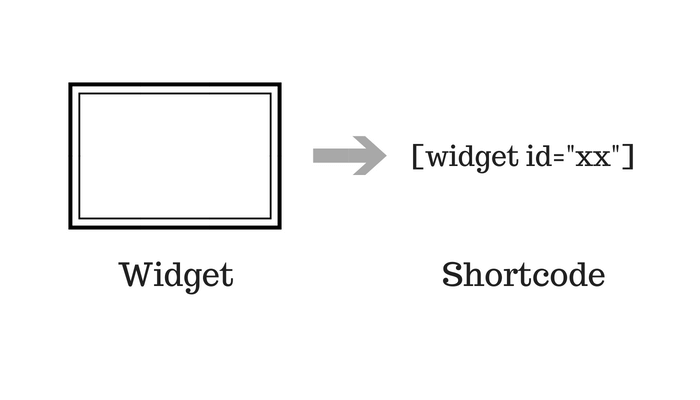
ウィジェットをショートコードで利用
こちらのブログで紹介されていた、「Widget Shortcode」というプラグインを利用しました。
本文中などで検索バーなどウィジェットで提供されている機能を表示したい時に便利です。
カテゴリー一覧ページに情報付加
カテゴリーの整理とあわせて、こちらの本をベースに、長年手をつけていなかったカテゴリページの充実をはかりました。
cocoonには便利な機能があるのでカスタマイズも楽々です。

またカテゴリー一覧をワンカラムにしました。
[https://wp-cocoon.com/community/customs/カテゴリーページをワンカラムにしたい/]
こちらのフォーラムでコードを教えていただき実装。
カテゴリ一覧のみ反映。
@media screen and (min-width: 1024px) {
	.category .main {
		width: 100%;
	}
	.category #sidebar {
		display:none;
	}
}
こちらのコードにすると、カテゴリ一覧・固定ページで反映。
@media screen and (min-width: 1024px) {
	.category .main,
	.page .main {
		width: 100%;
	}
	.category #sidebar,
	.page #sidebar {
		display:none;
	}
}
レシピ数が多かったこともあり、これを機にカテゴリー分けでして、最低限の検索性をもたせました。
趣味の水耕栽培のページも固定ページで作成したような雰囲気に編集しました。